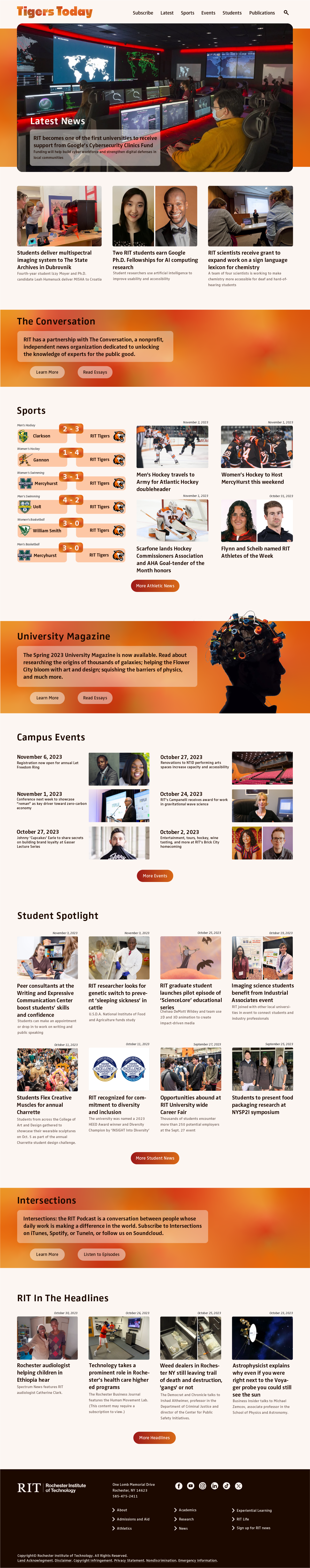
Univeristy News Homepage
Tools/Skills Used
- UXUI Design
- Figma
- Adobe Illustrator
Time
1 month
Goal of Project
To redesigning a static version of RIT's University News home page, focusing on improving upon the structure as well as the general appearance of the page keeping in mind basic graphic and UXUI design principles.
Project Type
School Assignment
Ideation
When it came to the style and colors of the page, I wanted to make more youthful and more marketable to current RIT students, not just alumni and parents, while also still having a very professional and clean appearance which led to me incorporating gradients throughout the whole page to accent, frame, and emphasize different elements of the page.
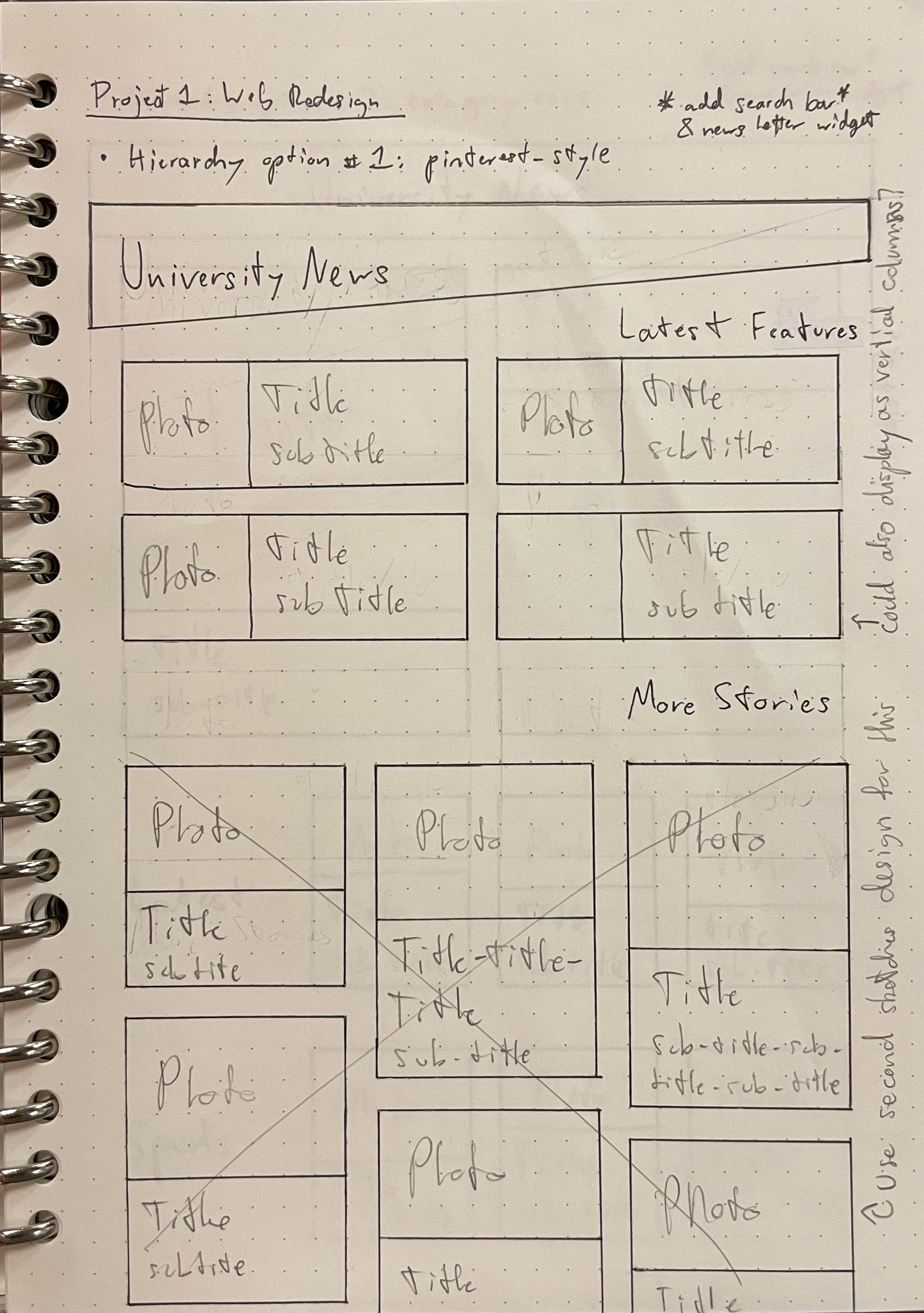
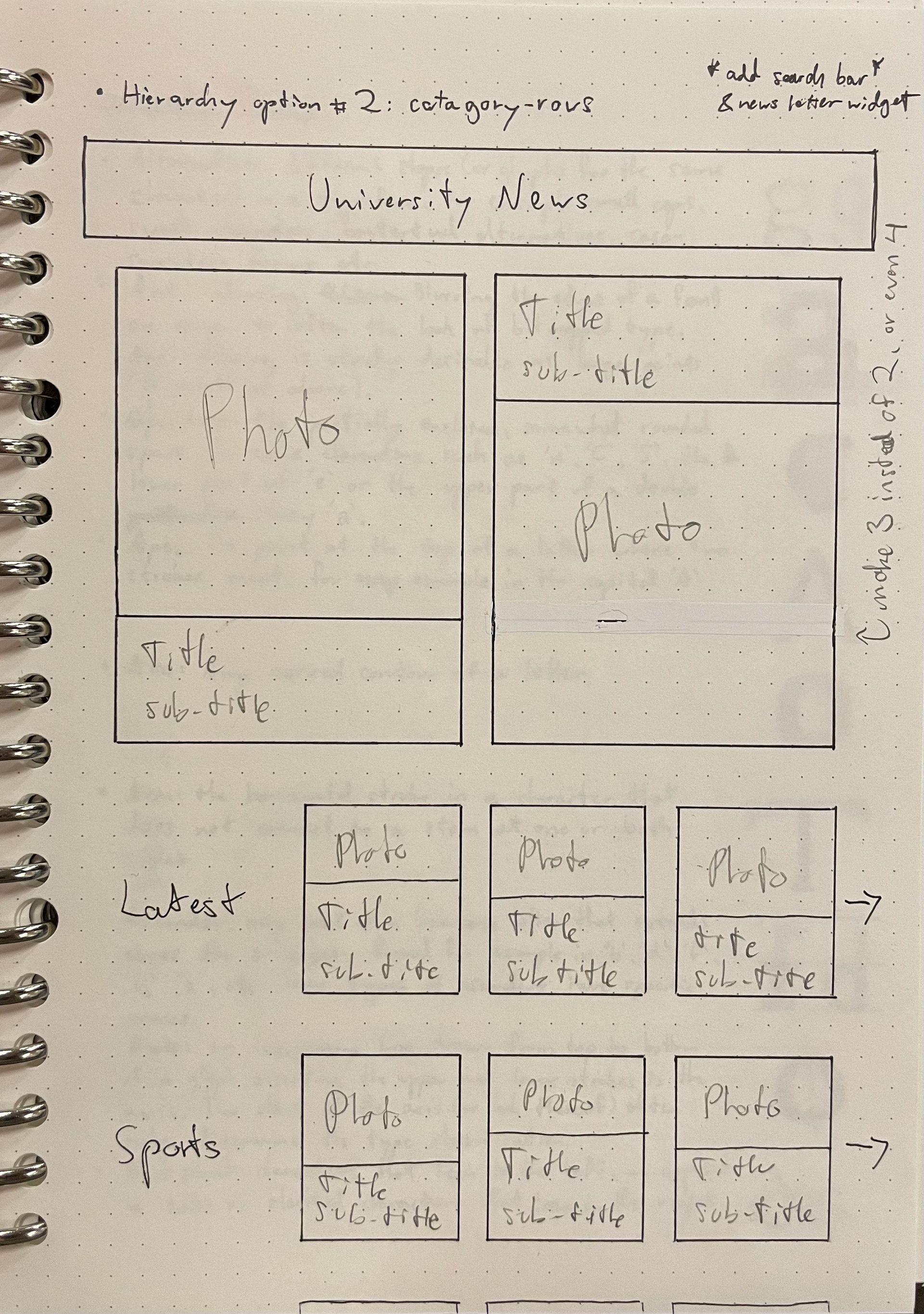
B&W Wireframes
I started with some low fidelity wireframes so expand the original informatin archetecture from my sketches, but to also explore some new ideas for organizing the content of the page.
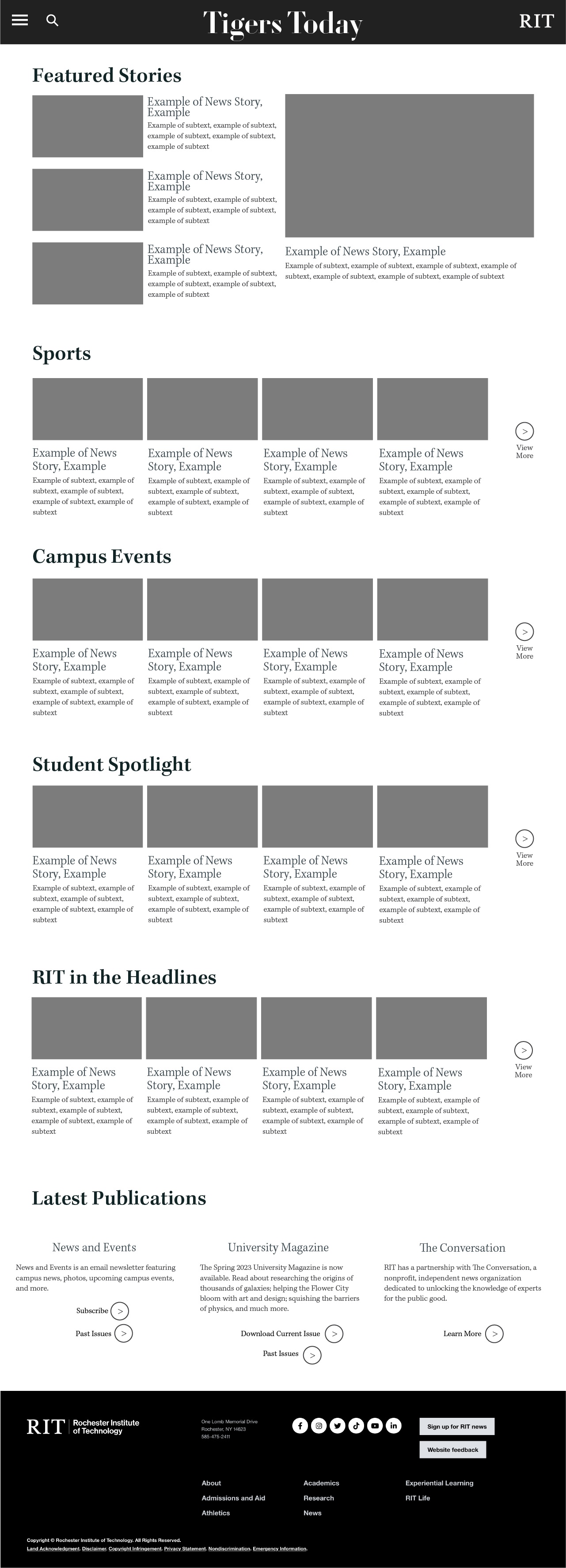
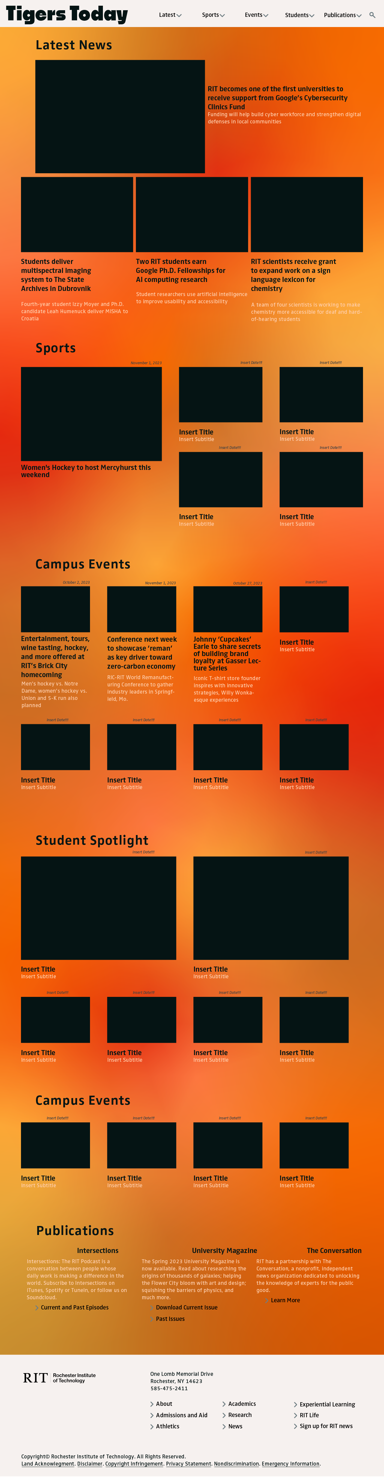
Mockup Iterations
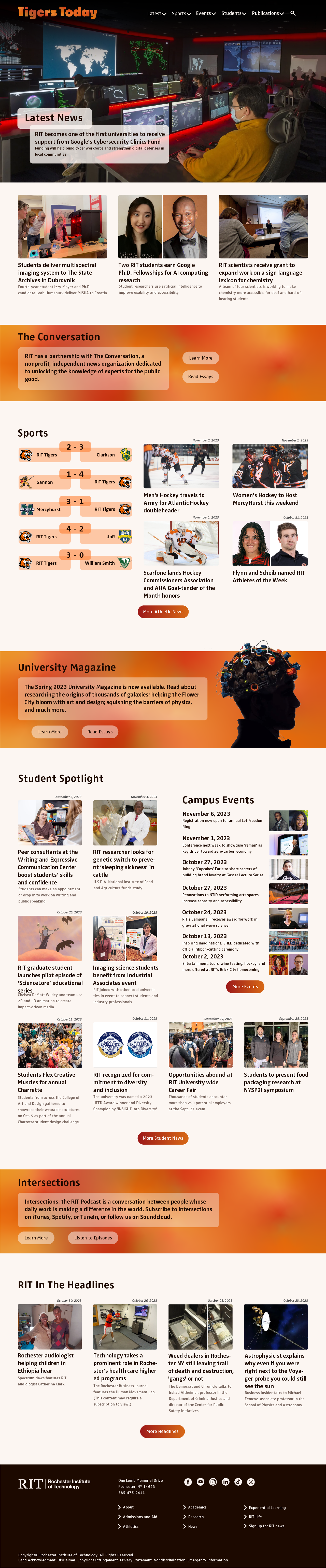
Final Mockup